I’m fascinated by modern iconography, and reducing information into a compact symbol that is easily understood and universally applied.
This article about the efforts (some of them inadvertent) to redesign the famous wheelchair / accessibility icon, and the emotions and controversy that’s raised, is pretty fascinating, too.
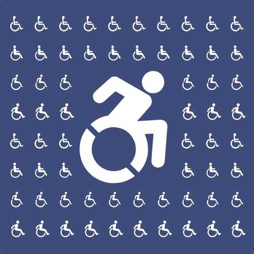
The Controversial Process of Redesigning the Wheelchair Symbol – Atlas Obscura
It has its own emoji, but where did the new Accessible Icon come from?

126 view(s)
It is such a shame that we associate "wheelchair" with "disabled" in this way.
+andrew mcmillan In what way?
+andrew mcmillan You don't like it, feel free to design a better symbol.
Well, the symbol was designed to indicate wheelchair useable access and parking, but I think I get your point +andrew mcmillan – it’s not the only form of disability.
+L Gorrie On the other hand, you need a symbol that's simple enough to recognize – if you try to make a symbol that covers all the disability categories covered by the ADA (or equivalent laws outside the US), you either end up with 3 zillion symbols that nobody knows/understands, or a creeping-horror mutation with 37 arms and 14.8 legs (which in itself is probably a disability)….
At some point, you have to balance "It's not 100% inclusive" against "screwing with it will probably cut the effective value of the symbol because it's no longer one well-recognized symbol".
+Valdis Klētnieks Don’t get me wrong; I think the current symbol is fine. Easily recognised and as close to universal as possible.
Mind you, I want to see that ‘creeping horror mutation with 37 arms and 14.8 legs’ … 😳