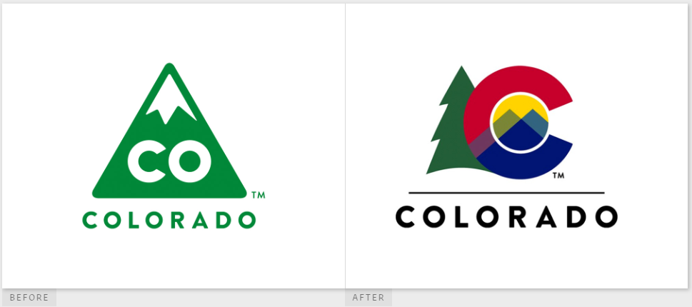
Apparently I was one of the five people in the state that liked the old triangular CO logo, for use by the government in letterhead and signage and other official purposes. I thought it was clean, bold, distinctive, and useful, and it also invoked our license plates.
As an added bonus, each state agency had a matching inverted triangle logo to use for their communications, creating a unified and attractive look.
The new logo? It looks like a tourist t-shirt, something you could pick up at a dozen stores on the 16th Street Mall. Or something to be used in promotional brochures by the state tourist board (“Come to Colorful Colorado!”). It’s moderately attractive, to be sure, and makes use of the state flag “C,” but I don’t see it being easily used everywhere. It will scale like crap, and really needs to be in full-color to be even recognizable. Plus, of course, now each agency will start doing their own new design-work to come up with something that (maybe) complements this, and the results are sure to be a mess.
Everyone criticized the money spent on the previous logo, which was designed by Evan Hecox, so this time around it was done in-house “for free.” And, honestly, I think it’s worth what they paid for it.
Do you want to know more?
- Brand New: New Logo for State of Colorado done In-house
- Gov. Jared Polis unveils new Colorado logo with tree, “C” from state flag – Boulder Daily Camera


Hell, the “old” logo even makes a great favicon for the state sites. Can’t see that working with the new one.