https://buy-zithromax.online buy kamagra usa https://antibiotics.top buy stromectol online https://deutschland-doxycycline.com https://ivermectin-apotheke.com kaufen cialis https://2-pharmaceuticals.com buy antibiotics online Online Pharmacy vermectin apotheke buy stromectol europe buy zithromax online https://kaufen-cialis.com levitra usa https://stromectol-apotheke.com buy doxycycline online https://buy-ivermectin.online https://stromectol-europe.com stromectol apotheke https://buyamoxil24x7.online deutschland doxycycline https://buy-stromectol.online https://doxycycline365.online https://levitra-usa.com buy ivermectin online buy amoxil online https://buykamagrausa.net

Trailers before “Eternals”

A couple of things I’m interested in, plus an annoying non-movie advert.

I always fine fascinating the question of what’s advertising before which film.

  • House of Gucci — Gee, a shame they couldn’t find any decent names for this film. But seriously, this is definitely a movie I will not be seeing, but I very much look forward to reading all the articles about it and the story behind it.
  • Clifford the Big Red Dog — I will likely not go because it is waaaaay too cute, but it looks like a great film for the kids. Even if it doesn’t have The Song.
  • Morbius — Never one of my go-tos in Spider-Man’s rogues gallery, but this looks nicely dark and creepy. Unlikely to go, as it’s not my wife’s cuppa, but it’s definitely a fresh, horror-tinged leaning into that tormented anti-hero vibe. Better than, alas …
  • The Batman — I confess I am sooooooo tired of Batman as tormented, anti-hero, insane, vengeance machine, out-grim-grittying-teeth-grinding each previous version in some weird attempt to turn him into an actual villain. Frankly, I think the trend has been out of control since Batman: The Animated Series wrapped up. So, no, I don’t think I’ll be going.
  • Sing 2 — I did not see the first one, but, damn, if this ad doesn’t make me want to see this one.
  • [Regal Theaters … why the hell is there a freaking crypto.com commercial in the middle of my movie previews? Also, “Fortune Favors the Brave” is not an investment strategy, no matter how buff Matt Damon looks.]
  • The King’s Man — Same ad as we saw last going. Looks fun, more so than the original Millar outing.
  • Encanto — I feel a bit like I am seeing the entire movie, bit by bit, as Disney keeps revising the commercials. But … I will still probably go, because it looks soooooo good.

Coming Soon

Movie trailers before “Black Widow”

Back in the theater again, with a look at what’s coming up.

We went to Black Widow on Friday night (no spoilers review, a fine movie, glad to go see it, and in an actual movie theater no less!), and here are the trailers we saw before the show.

Movie Trailers

The Protégé – Which, as a Samuel Jackson film about assassins I thought, at first, was for the new The Hitman’s Wife’s Bodyguard film, which it kind of looks like, only with no humor.  Meh.

Respect – I’m sure this biopic of Aretha Franklin will get huge plaudits and lead to greater fame for her work, all of which is fine and deserved. But I don’t expect to go see it. Not my cuppa.

Suicide Squad 2 – I’ve managed to avoid watching any trailers for this so far. What I saw looked interesting enough that I’ll certainly see it eventually, maybe even in a theater. It’s less zany than the first one pretended to be (in the trailers, at least), and I’m a long-time fan of the concept.

Old I’m … not ready for an M Night Shyamalan film yet, sorry. This one does look creepy in a number of ways, but it’s literally warning all of us that there’s a cheap gimmick at the end that will ruin it all.

Snake Eyes – I assume someone has decided to reboot the GI Joe franchise, and they are going the Marvel route of establishing a bunch of solo movies first before getting the gang together, a la The Avengers. If I was at all invested in GI Joe, I might be interested in this film, which looks appropriately actionish. But … I’m not.

Free Guy – An interesting cross between The Truman Show and Ready Player One. Not sure I’m as interested as I am curious about it, but I am open to being swayed to go see it by the time it opens.

Shang-Chi – It’s unfortunate that two comic-booky martial arts movies are coming up a the same time (see Snake Eyes). That said, I’ll almost certainly go to see this because MCU, but, never having been deeply interested in the original character, I’m not sitting at the edge of my seat, waiting for the day. It looks like they’ve filed off the Fu Manchu serial numbers well, and the Ten Rings look like they are not the Mandarin’s Ten Rings (the connection to the group that cause Tony Stark grief remains to be revealed), so that particular bit of Orientalism seems resolved. Still, this martial arts / crime family / super-powers film looks less awesome than it should. We’ll see.

And that was pretty much it, aside from some pre-previews of Jungle Cruise, which looked to be a lot of fun. Not counting that, make it two movies I’m likely to see, one definite maybe.

On the Naming of Stadiums

“What’s in a name?” asked Maybelline-sponsored Bard William “Honda” Shakespeare.

Los Angeles Memorial Coliseum is undergoing a massive (and overdue) renovation, under the auspices of its lease to USC. But one aspect of that renovation — selling naming rights to United Airlines for $69M — is meeting strong resistance both from veterans groups (even if the words “Memorial Coliseum”) would remain, and from people who just don’t like commercialized stadium names, esp. on ones that have multiple Olympics and deep-seated community history.

Visualized Coliseum rebranding

Put me in that latter category. I still say “Mile High” to refer to Whomeverissponsiringitnow Field at Mile High. It’s, to my mind, a level of commercialism too far. (To be fair, United considers that sort of naming compromise — “United Airlines Field at the Los Angeles Memorial Coliseum” — to be a level of commercialism not far enough.)

That does raise the issue of, well, if United is willing to pay for it, who else is going to step up if they don’t get the eye-share of their brand every time the Coliseum is mentioned? That’s not an insignificant question. If sponsoring companies weren’t given the opportunity to put their names up in giant lights (and be mentioned by name in almost every news story about competitions there), perhaps they’d still give for a lesser option. Or perhaps we’d just need to reevaluate how such facilities are funded, or what level of luxury they actually need to accommodate.

I realize that, in part, it’s all a matter of commercial relations and business and money and who’s willing to pay for what. But sports stadiums have a funny role in a community. Even when publicly owned (as the Coliseum is, though leased with full rights to USC), they remain to some degree publicly funded (usually through tax breaks to their owners).  And, while they aren’t quite public property — like government buildings and public parks and the like — they do hold  a similar mindshare: a landmark, a place that represents the community and “their” sportsball teams, and, with time, something much more.

I’ll be curious to see how things work out back in LA.

Do you want to know more? United Airlines Says If USC Doesn’t Rename Memorial Coliseum, They Are Willing To Drop Out Of $69M Deal : LAist

Colorado has a new state government “logo”. I’m … not impressed.

Let’s trade in a well-thought out logo system for something Bob down in reprographics designed for free!

Apparently I was one of the five people in the state that liked the old triangular CO logo, for use by the government in letterhead and signage and other official purposes. I thought it was clean, bold, distinctive, and useful, and it also invoked our license plates.

As an added bonus, each state agency had a matching inverted triangle logo to use for their communications, creating a unified and attractive look.

The new logo? It looks like a tourist t-shirt, something you could pick up at a dozen stores on the 16th Street Mall.  Or something to be used in promotional brochures by the state tourist board (“Come to Colorful Colorado!”).  It’s moderately attractive, to be sure, and makes use of the state flag “C,” but I don’t see it being easily used everywhere. It will scale like crap, and really needs to be in full-color to be even recognizable. Plus, of course, now each agency will start doing their own new design-work to come up with something that (maybe) complements this, and the results are sure to be a mess.

Everyone criticized the money spent on the previous logo, which was designed by Evan Hecox, so this time around it was done in-house “for free.” And, honestly, I think it’s worth what they paid for it.

Do you want to know more?

Movie Trailers before “Captain Marvel”

This was an interesting set, hitting on all sorts of themes (super-heroes, Disney, diversity, action) that someone thought would appeal to their anticipated Captain Marvel audience.

  • Best of Enemies — A black civil rights activist, a KKK member, and the odd friendship they developed. Interesting, but not my cuppa.
  • Hobbs and Shaw — If you want a Fast & Furious branded film with Dwayne Johnson and Jason Statham as frenemies against an evil Idris Elba … well, this is the film you’ve been waiting for.
  • Spider-Man: Far from Home — Spidey in Venice, vs Mysterio, with Nick Fury in the mix. Yeah, I’ll probably watch this.
  • Rocketman — If you’ve been waiting for a biopic of Elton John, this looks pretty good.
  • Late Night — Emma Thompson is an aging female night-time talk show host on the verge of being canceled. Mindy Kaling is the unconventional non-white-guy comedy writer (and director and writer of the film). Hilarity ensues. But not for me.
  • Godzilla: King of the Monsters — Okay, this looks pretty awesome, not least because it really deals with the helplessness of humanity in the face of kaiju battles. Also, King Ghidorah! Might see this one in theaters (I enjoyed King Kong last year).
  • Dark Phoenix — This looks terribly mediocre. And I say that as someone who really enjoyed X-Men: First Class.
  • Dumbo — An elephant with forward-facing eyes still looks weird. I trust all the talent to do something remarkable, but I’m still not sold.
  • Frozen 2 — The trailer looks good and certainly makes me want to see the movie. Will I? Who can say?

“5G” should mean something

I don’t use Sprint, but I applaud their pushing back against deceptive and sloppy “standards” labeling. #5g #carrierssuck #att https://t.co/7xZmvOOcwe

Logo changes of 2018

Honestly, none of the ones listed thrill me, though the MailChimp one isn't bad. The rest range from unnecessary (really, "Dunkin'"?) to the unfortunate (I frankly liked the old Animal Planet logo) to the outright ugly and brand-damaging (looking at you, Best Buy).

Significantly change logos when (a) what you have is ugly, (b) what you have is forgettable, or (c) what you have no longer reflects who you are. Otherwise you are, at best, simply enriching some very expensive advertising / image agency (who will always be willing to do a major redesign for you, ch-ching). Redesign for the sake of redesign rarely ends well.


The 13 Best and Worst Logos of 2018
Some of these rebrands were long overdue. Others did not go over well.

Original Post

Service Dinosaur

Heh.

#jurasicworld #travel #serviceanimal

Original Post

What is it about insurance commercials these days?

I swear to God, the funniest commercials on TV right now, and for a while, are from Geico — with Progressive and Farmers trailing closely behind.

I'm not sure why that's the case (at least to my aesthetic), but as I'm FFing through commercials on the DVR, those are the ones that make me stop and watch.

GEICO: https://www.youtube.com/user/GEICO
Progressive: https://www.youtube.com/user/progressive
Farmers: https://www.youtube.com/user/farmersinsurance

Original Post

Movie Trailers before “Avengers: Infinity War”

Mission Impossible: Fallout — I love it that the MI series is getting so meta that the fact that Ethan keeps being betrayed by his own country isn’t seen as a weakness in the series, but as a new plot point to exploit. Those who like MI films (which I admit I kind of do) will find this the sort of thing they like (whether or not they go to see it in a theater).

The Meg — It’s Jaws, with a bigger CG budget, as a prehistoric giant shark does just what you would expect it to do with an underwater lab and a beach community. Ho-hum.

Adrift — I kept waiting for the prehistoric giant shark to eat the sailboat that the beautiful young couple are stranded on in the middle of the Pacific. Based on a true story (sans giant shark). Not my cuppa.

Jurassic World: Fallen Kingdom — Those who like the Jurassic movies will likely enjoy this. The previous trailers made it look like it was about rescuing dinosaurs from the island (which has abruptly gone all volcanic). The new trailer indicates that things are a bit more sinister than that.

Venom — I have never been a fan of Venom in the comics, but this looks pretty good. The trailer gave enough story to hook me without telling the whole movie. I suspect this is one I’ll stream eventually.

Incredibles 2 — I’ve already seen this trailer, but it remains good-looking. I am hopeful it will match the original.

Solo — Same trailer as before, but I’m still liking it. The actor does look a bit “prettier” than Harrison Ford, but I’m willing to put up with that.

So seven trailer, with just the last two likely theater revisits. Not bad.

View on Google+

Google Maps is experimenting with natural directions

Like, “Turn right at the Burger King.”

Which sounds like a cool idea, and probably is in 99% of the cases. I can see wanting to limit the types of companies used as land marks (Burger King is obvious; Smith and Jones Legal Offices on the 14th Floor, probably not), and there’s a danger of companies going out of business. But that sounds like a refinement.

Plus, I now understand better the Maps Contributor questions about “Is this business plainly visible from the street?”


Google Maps uses landmarks to provide natural-sounding directions
Google Maps now uses local landmarks to give you more human-like directions.

View on Google+

On redesigning an icon

I’m fascinated by modern iconography, and reducing information into a compact symbol that is easily understood and universally applied.

This article about the efforts (some of them inadvertent) to redesign the famous wheelchair / accessibility icon, and the emotions and controversy that’s raised, is pretty fascinating, too.


The Controversial Process of Redesigning the Wheelchair Symbol – Atlas Obscura
It has its own emoji, but where did the new Accessible Icon come from?

View on Google+

Thursday in the Park with Crowds

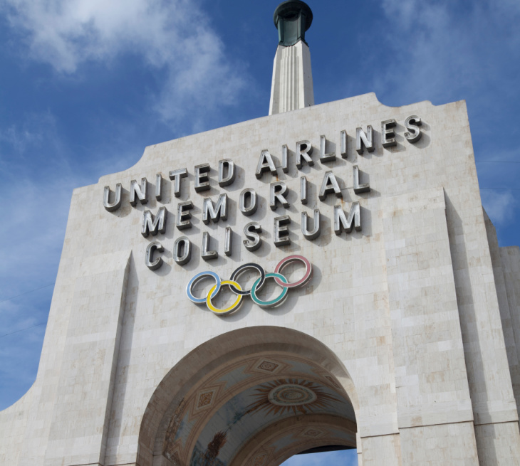
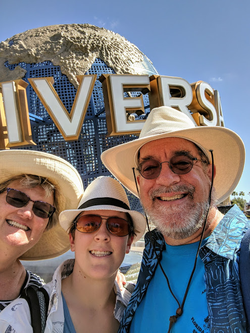
As the last day of the big high school band/orchestra trip, and after two days at Walt Disney World (at one of which the kids actually did a very interesting clinic involving sound tracks ), our partial last day before heading to the airport was spent at Universal Studios in Orlando.

For all our many trips to WDW, we’ve never done Universal, so I was looking forward to it based on all ads and people going and ooohing and aaahing over the new Harry Potter stuff and so forth.

Short summary: a mixed bag of interesting ride technology, area and ride theming that was very good to “bad show,” and a real dislike of “if someone wants to throw money at it, they can go to the front of the line on any ride they want.”

For the record, we did stuff at both Islands of Adventure and the Universal Studios park. Rides we managed to go on in our 5-odd hours there:

  • Harry Potter and the Forbidden Journey (nicely done signature ride)
  • The Harry Potter Hippogriff coaster (too short for the wait)
  • The Hogwarts Express (excellent use of simple technologies)
  • Harry Potter and the Gringotts Heist, or whatever it’s called (well done, though very dialog-heavy for an action ride)
  • Men in Black (fun gallery-shooting ride, with short lines)

Lines ranged up to a bit over an hour and a half.

A few thoughts:

— Harry Potter academic / wizardly robes are not suited to the Florida climate, either for park workers or for the kids we saw running around in them.

— A plethora of Harry Potter wands being waved about by little kids almost certainly has to result in a lot of eye injuries on any given day, given the crowds.

— The rides were all generally pretty good; the two HP showcase rides were multi-media of practical effects, physical movement, and video projections, all blended satisfactorily. For the record, we enjoyed Forbidden Journey over Gringotts, though the latter is usually more highly rated.

— Lots of effective use of video displays and so forth in the various HP zones (for moving portraits, for animated newspapers and wanted posters, etc.)

— Universal does a lot with in-ride or ride-adjacent lockers for loose items. Somehow, that was never a problem at WDW, but at Universal it was always a madhouse (esp. with the in-ride ones) to get a locker (or two) and then to recover the items after (when the finger-print readers worked).

— Lots of stairs at Universal inside the rides.

— Some of the theming was excellent. Hogsmeade was a gorgeous winter-bound town, and Diagon Alley was a lovely zone as well. One could easily spend much more time them, just pushing your way through the over-filled and over-crowded shops and peering through the windows.

The same was true in the areas we went to elsewhere. Walking through the Dr. Seuss zone was surreal, and felt just like what it should.

That said, there were plenty of cases of “bad show” — unthemed elements visible where they should not be, chinks in the illusion. My sense is that Universal hasn’t caught up to Disney there.

— All the things we went on were fun, and I don’t regret the time spent there.

— To generalize, though, Disney create a broad environment that tries to grab you before you enter and goes with you through the whole day. There is a sense there of commitment to you as the guest, and an eye to detail that remains exquisite.

Universal is out for the wham-bam experience. The zones and rides and so forth are chock-a-block, with little rhyme or reason. Why is there a San Francisco area, and why is it across the lake from Springfield? Where would one expect to find Dr. Seuss? There are zones, but no theme.

This ties into Universal’s broader use of big movement, fast movement, thrill rides. Disney tries to provide thrills mostly through engagement in the overall park experience and immersion in the story. Universal focuses more on fastest, biggest, wildest. Both are valid approaches, both have their audiences, but in the end it makes (for me) the Universal experience feel a bit more frenetic, more forgettable.

Moreover, though Disney is certainly not at all cheap, Universal seems to really emphasize the the commercial nature of the the park experience, complete with two tiers of “I get to cut to the front of the line” tickets that are available for gobs of cash; while Disney does this to some degree with FastPass, that’s for free and is clearly an effort to manage crowds; Universal’s is clearly an effort to build an additional revenue stream. Both offend social conventions against queue jumping, but Universal’s felt more egregious.

Or, put another way (this via the young’un): going to Disney World is like going to the grandparents house for the holidays — they’re going to care for you, take care of you, and if it’s not going to be thrilling, it’s going to be fun. Universal is more like the aunt you visit sometimes who always has cupcakes and who has really weird furniture that doesn’t quite smell right — it’s also enjoyable, even exciting, but also not where you want to spend all your vacation.

After this trip, I’d love to go spend more time at Universal, at a more sedate pace, and explore some of the other things they have there. But I’d rather go back to WDW again and be able to do the same.

View on Google+

Shipboard Warning

“Press button to activate electro-cannon in case of attack by many-tentacled horrors from the depths.”

View on Google+

New “Who”

BBC has unveiled the new logo for Doctor Who. I like it, I really do, but, frankly, it feels like we’ve had more Doctor Who logos since the 1995 restart than we’ve had Doctors, and some of them were quite good, too.

Is there a special logo-generating office at the Beeb that has to keep coming up with new logos or else lose their budget?


About time! BBC unveils new ‘Doctor Who’ logo
The latest season of time travel show to premiere on BBC America this Fall

View on Google+

On the Introduction of Diet Coke

While a bit self-congratulatory in places, this history of the development and roll-out of Diet Coke has some interesting trivia tidbits (the lower case “d” in the name was both a branding and legal decision) that make it worth a read.


The Extraordinary Story of How Diet Coke Came to Be
The original Diet Coke team tells the story of how they created, launched and marketed the number-one rated diet soda brand.

View on Google+

The tone-deafness of business in neighborhoods

Is “gentrification” a bad thing?

Well, it’s a good thing, to the extent that it means attracting commerce to an area and increasing spending and investment there.

It’s a bad thing, to the extent that it represents pushing people out of neighborhoods, and changing the nature of those neighborhoods into what attracts the most commerce.

Regardless, it’s not something you want to advertise without a ton of context and nuance and neighborhood buy-in.


Avi Selk

View on Google+

Does anyone actually give a car as a Christmas gift?

Because, as it’s Christmas Time, every car commercial seems to be about Cars with Giant Bows being Given as Gifts, and I’m trying to figure out if this is just symbolic thing, a real thing, or something car companies want to make a real thing.

View on Google+

“Atlas!”

This Squarespace commercial has been out for a while, but I only spotted it while binge-watching some shows while sick. It’s both funny in that “awkward album covers” way, but also a useful look at how branding can help distinguish (or not distinguish) a person or company.


View on Google+