The "This is how far you are through the search pages" colored "O" in Google's search results is a lot more visible, thus usable, than it used to be.
I doubt that was the primary intent, but it's a nice bennie.

799 view(s)
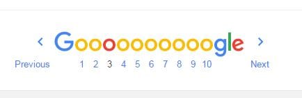
The "This is how far you are through the search pages" colored "O" in Google's search results is a lot more visible, thus usable, than it used to be.
I doubt that was the primary intent, but it's a nice bennie.
I still use paper dictionary
+Micheal Yarbrough Unfortunately, that is only a minor use case
Though, to be honest, as much as I love dictionaries, I can't remember the last time I actually consulted a paper one.
Honesty good for buis.
Ok, my Google doesn’t do stuff like this. It gives me the same old search pages. Just a new logo.
Marc
It looks like they just switched over to Roboto, the official android font.
+Michelle Norton It's actually a font called "Product Sans," introduced with the Alphabet announcement.