I’m enough of a traditionalist to not particularly care for these paintings, and the one of Michelle just doesn’t look to her to my eye (though I’m happy to see t bare arms).
But the Barack painting has been growing on me since I first saw it. And, honestly, it’s worth it just to see the purists and the racists get the vapors (and thus provide some fine, first-grade block bait).
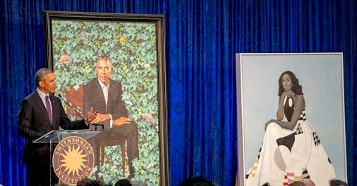
The Obamas’ Official Portraits, Revealed – The Atlantic
Kehinde Wiley and Amy Sherald rose to the occasion with their paintings of the former president and first lady, while—importantly—continuing their radical projects in black portraiture.

115 view(s)
I thought that the Michelle portrait wasn't accurate. The other is more recognisable but the proportion of length to width of the head is slightly wrong; he resembles Lee Marvin.
I like 'em, mainly because they are not the same as all the others. Obama's picture will disrupt the line of previous Presidential pictures quite nicely. I am a huge fan of realism in formal paintings, but this is a nice change, while keeping him realistic. My wife loves Michelle's picture; I like it but not overwhelmingly.
The only other "non-standard" paintings were of Raegan, who was painted outside and smiling broadly, and Kennedy, who is shown solitarius and brooding. Kennedy's is my favourite by far.
I agree wit u…michells doesn't look like her…they didn't notice that???😞😞
What about the one that had a Black woman with the decapitated white woman's head?….hmmm?…same artist right?
Might tell you something about where the racism is coming from.
https://plus.google.com/photos/…
Presumably Michelle's, rather than being a precise re-creation of her, is some type of stylistic thingamajig that +Chris Kim A would have to educate me about. (And yes, Dave, I support the right to bare arms.)
Someone else observed that the background of Barack's picture is reminiscent of Wrigley Field – which is terrible, since Barack is a South Side (i.e. White Sox) person.
It looked better on the TV.
+John E. Bredehoft
Wouldn't that make sense for the red flowers?
WEIRD THEY ARE!
They aren't bad paintings in themselves (though they aren't particularly good either), but as official portraits these will stand out the same way that pastel leisure suits stand out in '70s prom photos.
However, Obama's portrait makes me think of magical realism, which seems appropriate for his presidency.
Both are technically good.
I like Barack's portrait. It's warm and approachable. The botanical theme also robs the scene of depth and makes him appear to float, which is a nice, subtle. Michelle's just seems like some 70s thing that hangs in your grandma's home. It just fails to impress this viewer.
I just saw that on the news a few minutes ago?
Michelle painting do not look anything like her on the other hand Barack is on 💰.
It's damned difficult to say at any given moment what art will be seen as a radical beacon that changes everything in the future, and what will be the equivalent of leisure suits. I'll be curious (in the abstract) to see what people think in fifty years.
+John 'INRI' Here's a bit more, um, un-racist look at the artist and those paintings: https://www.snopes.com/kehinde-wiley-painted-black-woman-severed-head/
Eh. Art is expression. I don't care about the subject matter so much as the technique and aesthetics of it, which I find Wiley's style to be pleasing. They can cry racism all the want, the shoe is on the other foot and that is the power of art.
Sure beats an unmade bed or buckets of poo.