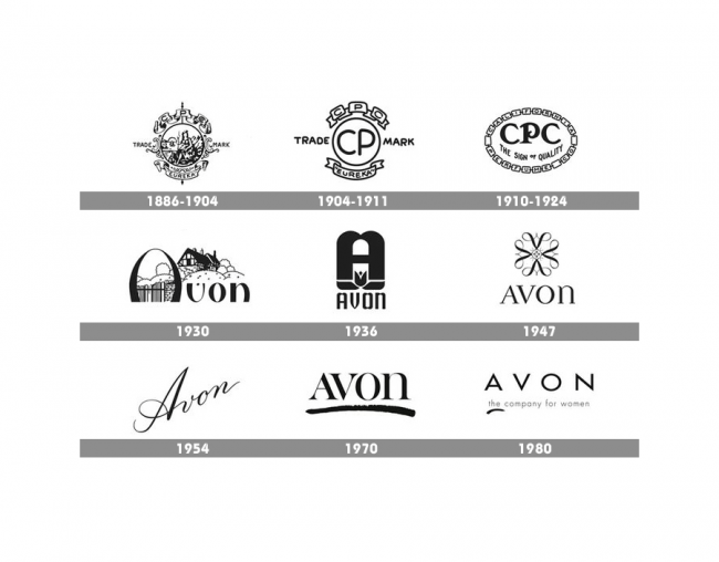
I’m always kind of fascinated by logo design and branding. Avon’s new logo is definitely a call-out to the 70s past, and a break with the rather stark imagery they used last time around.


For myself, the 70s one is what I remember; indeed, if pressed, I couldn’t have told you that one only lasted a decade, and that there was a replacement and it’s been around for (eep!) nearly four decades.
Do you want to know more? Brand New: New Logo for Avon
