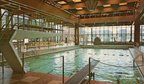
We went up to the Sunset Idea House here in Denver today. They'd taken a mid-century ranch, popped the top to add a second floor, gutted the interior rooms and made it over in mid-century style.
The Good – Well, mid-century thematically remains one of my favorite decorating motifs, and was the inspiration for what we did with the kitchen.
The bathroom and kitchen tilework and flooring were all pretty nice, as were any number of period decoration accents (including the Star Trek inspired stairway screen).
The fairly open floorplan was a nice revision of what the house originally was like, without being nebulous as so many open floorplans are.
I loved the translucent garage door.
The Bad – The house still routes into the kitchen with little opportunity to divert traffic. The rooftop deck was fun but needed significantly more shading. The wet bar in the entertainment room in the basement had no outlets and no lighting.
The yard was more suggestive than practical. The patio shades were for an area that would never get direct sun, and the areas getting direct sun were fully unshaded. The ash trees have (as Mary noted) a limited life span given current tree problems, and the aspens were in a similar boat. The touted sprinkling system was inefficent, IMO, for the large areas it was to cover. The shade plants were in far too much sun.
The concrete-gray Caesar-stone countertops kind of worked in some areas, but in other areas came across as (deceptively) cheap.
There was no real plan for dealing with visual privacy with the neighbors. The large windows on the south / street side would need (lacking) window treatment and would simply let in a ton of heat in the summer.
The back gate was a very nice two-door gate, but the way it was hinged (and then the sidewalk outside it bent) would make it a real struggle taking the trash cans out.
The Ugly – For a Sunset house, there was a shocking level of quality. Caulk seams missing. Bathroom arrangements (toilets vs shower openings) were cattywampus. Walls and ceiling areas that had either been opened for repairs / fixes and not closed, or closed but not repainted. The cinderblock frame for the back porch was not only unfinished up top (visible from the second floor), but had concrete dribbling down the sides. The trash can storage area is plainly visible from one of the back hard entertainment areas.
Overall, lots of cool ideas, furniture, decorator accents, and lovely tile work, and a remarkable transformation of a house. But lots of small problems and some significant ones makes me … disinclined to approach the $2M selling price, let alone the $470K original purchase price.
See also: http://www.sunset.com/home/idea-houses/denver-idea-house

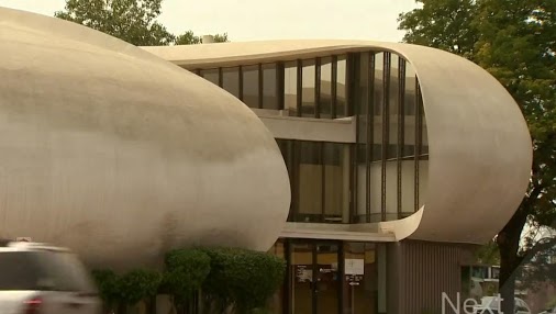
Sunset’s Idea House in Denver is open weekends through Sept. 13
Sunset’s 2015 Idea House in Denver is opens weekends through Sept. 13
View on Google+
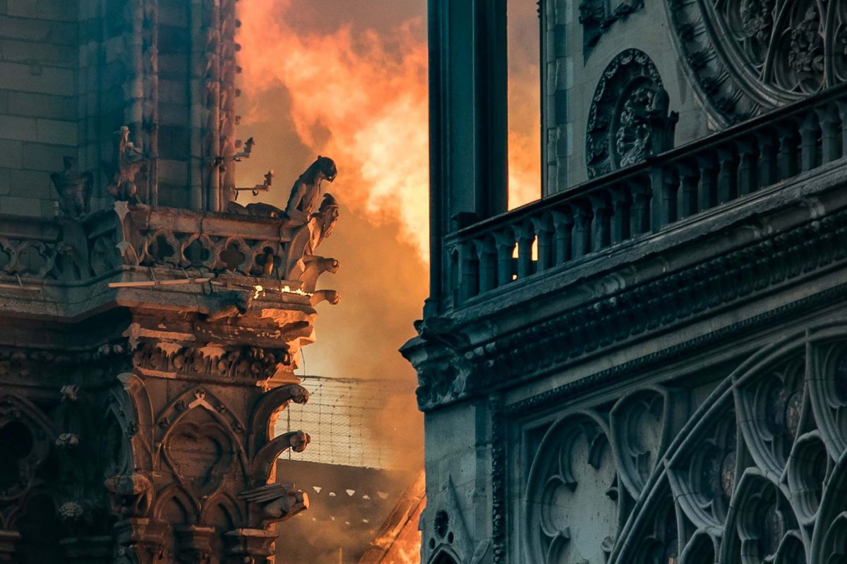
 It appears that most of the external structure is still intact, and at least some of the rose windows as well. What was there can be rebuilt, though as one scholar noted, the “layers of history” — the things that were tweaked, covered over, redone, repainted, revised over the centuries, that “revision trail” has been lost. One can theoretically replace the appearance of everything that was there (in such a highly photographed and studied structure), but it will always be a replacement.
 From a Christian perspective, it’s both tragic as a loss, but also darkly ironic as Lent is wrapping up — Remember, man, that dust thou art, and to dust thou shall return. Again, nothing material is permanent, and relying on such permanence is vanity and delusion.